

d.o.g.s

MY ROLE & RESPONSIBILITIES
UX Researcher
UI Design Concept
Mid-Fi/Hi-Fi Wireframes
Prototyping
TOOLS
Figma
Trello
Miro
Invision
Adobe Illustrator
TIMELINE
3 weeks
PLATFORMS
Mobile + Desktop
GOAL
Creating a responsive mobile and web design of a non-profit organization to help meet the users need to donate, find assistance, or understand what the organization does, which is causing a high bounce rate to
the business.
COLLABORATORS
Pa Chang Her
Wakako Nishimura-Anderson
Kenzo Onoo
Rain Lokadottir


Problem + Solution

What is D.O.G.S?
How did we approach it?
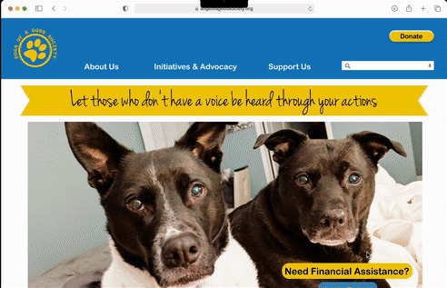
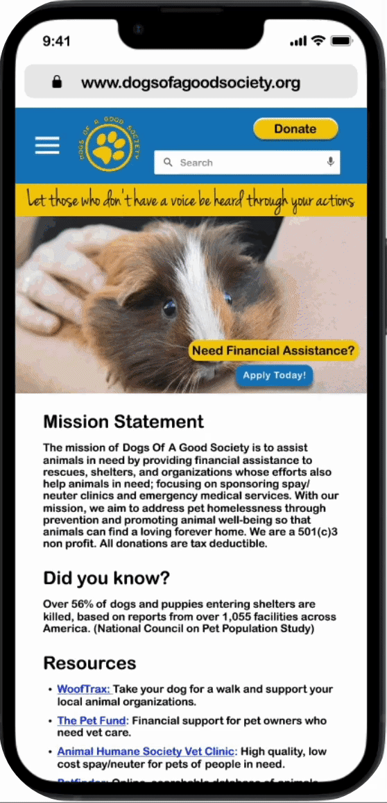
Dogs Of A Good Society or D.O.G.S., is a non-profit with a goal of providing financial support to animal rescues in order to save animals in need. We have observed that the website isn’t meeting the users need to donate, find assistance, or understand what the organization does, which is causing a high bounce rate to the business.
We took a human-centered approach through research and testing and conducted an information architecture (IA) reconstruction to ensure related pages were united under a simple navigation, created an in-house assistance application form, and designed a new call-to-action and hero banner to provide clarity to the nonprofit's mission.


User Research

Our team conducted extensive research, including 14 one-on-one interviews, 2 stakeholder interviews, and 10 completed surveys.
Key user pain points included an outdated website UI, unclear social media links, and difficulty identifying the nonprofit’s mission at first glance. Many users also struggled to locate the Assistance Application form.
Stakeholders highlighted concerns that users were unaware they support animals beyond dogs and preferred hosting the assistance form in-house rather than as an external Google link.
Survey results revealed that users want transparency on donation usage, prefer online donations, actively use social media, and that rescuers often seek financial support.
Using these insights, the team developed a proto-persona to guide design decisions and refine user experience assumptions.


Define + Ideate

After conducting an empathy map using user interview insights, the team identified two key user personas, with Hannah Stowes being the primary focus due to her significant needs.
To generate ideas for improving the nonprofit’s website, the team utilized the I Like, I Wish, What If method and voted on the most impactful solutions. Key ideas included creating a merchandise shop and an auto-populated list of rescues to streamline the assistance application process.
The most voted ideas were then organized into a feature prioritization matrix, helping determine which solutions to implement based on feasibility, stakeholder input, and user interview findings.


UI Style Tile

-
Maintain consistent and close to original color palette as per stakeholder request
-
Utilized mood board images to create and grab inspiration for a more appealing shade of yellow
-
Inspired by clean and simple fonts for clear and easy to read for users
-
Updated logo on white and dark ground with updated color
-
Utilized social media iconography for social callouts in the footer in addition to, search and mic for the search bar
-
Created different button state versions for an interactive design

Lo+Mid-Fi Wireframes


In order to pinpoint the main problems with the current version, user testing was an iterative process that was carried out at each project milestone. Prototypes were iterated and retested after gathering feedback from our guerrilla user testings.
We wanted to design a clean, modern, and energizing user interface for the brand that communicated reliability and relevance to their cause. There is no mobile/RWD version of the site. We also added a CTA button within hero banner for users to easily access assistance application.
Some things we added:
-
Created new navigation with hamburger menu
-
Added search bar
-
Moved social media to the footer to avoid clutter at top of navigation
-
Recreated top banner with actual text so it isn’t pixelated and can be read via screen reader (previous version was an image without tags)
Prototyping

-
Desktop & Mobile High Fidelity Prototype
-
Stayed true to the main color palette per stakeholder request
-
Added photos of other animals to showcase that the org caters to a variety of animals, not just dogs
-
Created a built-in form to replace the old Google form

Usability Testing


The team conducted basic card sorting to reorganize three unlinked sections from Version 1, integrating them into related sections in Version 2.
For mid-fidelity testing, affinity diagrams were created, with desktop notes on the left and mobile notes on the right. A key takeaway was the need for a clear Call to Action on the banner, which was incorporated into the high-fidelity design. Since this version was in grayscale and lacked images, some users found the mission statement unclear—particularly in recognizing that Dogs of a Good Society supports animals beyond dogs.
Two high-fidelity versions were developed for A/B testing, differing in how the assistance form was labeled and the featured image. Version B, which included a labeled assistance application and an image of a veterinarian, was preferred by all users. Additionally, a carousel was added to the hero banner, featuring images of not only dogs but also cats, rabbits, and guinea pigs to clarify the organization’s broader mission.

Takeaways

Theme: Mission Statement is confusing
What we heard from users:
-
“The mission statement feels like it’s a rescue or humane society.”
-
“I would like the have the mission statement go straight to the point.”
-
“Thought this was a non-profit that helped dogs.”
-
“A bit bland and very word heavy. I need shorter chunks of info and less to scroll through so it’s less intimidating to read.”
Future next steps:
-
Create a shorter, easier to digest statement on the homepage of what the organization does
Theme: Users struggled to understand the fields in the Assistance Form
What we heard from users:
“I’m not sure what the date field is for. Today’s date? When we should expect to receive assistance?”
“Is the phone and email needed from the requestor or the rescue’s info?”
Future next steps:
Ideation session to determine which fields were necessary and how might we label them appropriately for users to understand