

u.s. dept of education

MY ROLE & RESPONSIBILITIES
UX Researcher
UI Design Concept
Mid-Fi/Hi-Fi Wireframes
Prototyping
TOOLS
Figma
Trello
Miro
Invision
TIMELINE
4 weeks
PLATFORMS
Mobile + Web
GOAL
Creating a responsive mobile and web redesign of the Department of Education government website for a more efficient navigation for users to get the information they need at an instant.
COLLABORATORS
Pa Chang Her
Graham Smith
Gwen Neece


Problem + Solution


U.S. Dept Edu Mission
How did we approach it?
“ED's mission is to promote student achievement and preparation for global competitiveness by fostering educational excellence and ensuring equal access. ED was created in 1980 by combining offices from several federal agencies.”
We analyzed the user interface and concluded that the current website had overwhelming information that doesn't provide efficient navigation, information hierarchy, or useful links for education related resources. Then created a responsive mobile and web redesign of the Department of Education government website for a more efficient navigation for users to get the information they need at an instant.

User Research

After evaluating the website’s user experience, the team focused on users who rely on it for their daily work. The primary user persona, Faye Carson, is a College Prep Counselor who helps students navigate college funding options. She frequently uses the DOE website to access FAFSA eligibility details and background data to guide students and parents.
User research, including five one-on-one interviews, revealed that 80% of participants successfully found FAFSA eligibility and college information. However, navigation issues arose due to unclear clickable elements and excessive, redundant content that overwhelmed users.
These findings will inform the website’s redesign, ensuring a more seamless, clear, and user-friendly experience tailored to users' needs.


Information Architecture

Usability testing revealed key pain points in website navigation, including ineffective resource accessibility, an unclickable logo for homepage redirection, and an overwhelming amount of information on pages. Users often relied on the back button, highlighting a need for improved navigation.
These insights guided the final card sorting process, refining the sitemap to enhance user flow by prioritizing relevant content and relocating unnecessary information, such as legal details, to subcategories.
With the revised sitemap, a new navigation UI prototype was created, ensuring a clearer structure that prevents information overload. The design applies the LATCH principle, organizing content for a more seamless and user-friendly experience.


UI Design + Testing

I redesigned the desktop and mobile UI components for the main navigation and footer, giving the website a facelift as running website was a bit outdated. Maintained same navigation menus but gave a clear indicator that those menus are clickable and offers a dropdown box.
Provided a language dropdown as accessibility access for users where English is not their first language. Researched the most popular speaking languages who uses the website and narrowed from there.
In the footer, I made the quick links real quick links to information the user might find helpful, then a redundant of the main navigation dropdown sitemap.


Usability Testing
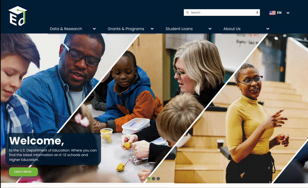
Homepage - V1

Higher Ed - V2

Homepage - V2

K-12 - V2


V2 Iterations
-
Based on user test, changed font sizes for subhead and body.
-
Adjusted social media spacing for mobile
-
Changed navigation bar when selected and on current page to darker color so you are able to see the white text (e.g.Data & Research on next slide)
-
Adjusted placement of the navigation bar just a touch so that the dropdown menu isn’t floating on top of the header bar.
-
Made search bar more prominent in size for easier accessibility
-
Adjusted hero title content layout to be visually presentable
-
Added mobile android kit (time/battery header) to help with padding of layout as user was not able to see the search menu and hamburger as it was being blocked by the phone camera.
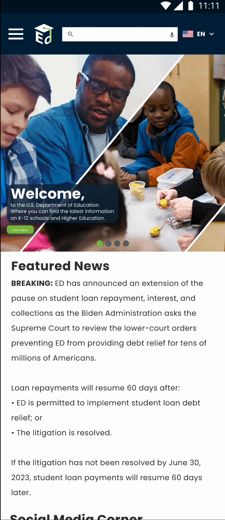
Mobile - V2


UI Style Tile

Maintained colors of the logo as the main palette for the website.
Font choice was selected by inspiration of having clean and easy to read font.
Selected icons to help with association of the topic/information it leads to.
Added more flags to help indicate a diverse range of languages.
Image and graphic styles were the inspiration of what the ideal infographics, photos would be seen on the website to help relate to what the site offers.

Prototyping

-
Based on user test, updated layout to fit a 12-UI grid for Desktop and a 8-UI grid
-
Changed the hero image to have animated delay instead of a manual horizontal scroll
-
Adjusted pages to be more responsive
-
Fixed font sizes to align style guide/tile
-
Made sure Data & Research navigation was functional to redirect to its landing pages
-
Made sure all navigation tabs dropdown function worked and showcased the submenus
-
Adjusted the language dropdown menu to show selected language when chose


Takeaways

Theme: Navigation Menu
Future next steps:
-
Create additional landing pages for the rest of the menu
-
Make sure fonts are clear and easy to read and see
-
Make sure all contents are easy to find and user can find info as needed
-
Maintain minimal information (no data dump)
-
Clear between a scroll and automated (delayed) images (CTA if applicable)
-
Keep up-to-date with social media